
Chris Alo from Sea of Tranquility always said to never include a photo of the band on their album cover because it’ll date faster. I say he’s partially right. It all depends on the clothes, how the band poses in the picture, the band logo, and the overall aesthetic of it. Some album covers that include a photo of the band are great and some are terrible. With that in mind, I’m going to talk about eight album covers that include a photo of the band, explaining why they work or why they don’t work. Let’s get on with the album covers!
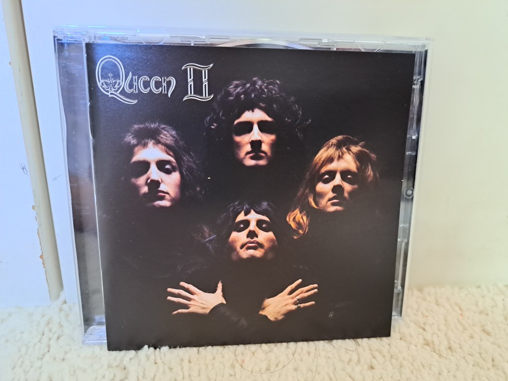
The album cover for Queen II (1974) is so iconic. Not only was it replicated for the “Bohemian Rhapsody” music video, but fans around the world, musicians and non-musicians, have replicated that album cover, as well. It’s my favorite Queen album cover because the guys look so cool on it. Everything from the clothes, the dramatic lighting, the old Queen logo, and the black background is breathtaking. Plus, the moody album cover fits the songs on Queen II because they’re heavy and it’s basically the band doing progressive rock.

Next up, is AC/DC’s Highway to Hell (1979). As mentioned in my album review, I was terrified of the Highway to Hell album cover because the guys look like they’re sons of the devil, especially Malcolm Young. He has an unsettling look and because of that, I avoided the album for years. Once I finally got into AC/DC, it ended up being my favorite album cover that they ever did. With the bright red logo, the brown and black backdrop, Angus Young wearing his devil horns, and the guys looking evil, it’s brilliant. I kind of wish the boys did a similar album cover with Brian Johnson, but at the same time, they probably wouldn’t have been able to top Highway to Hell anyways.

Switching over to a terrible album cover, the artwork for Cinderella’s Night Songs (1986) is a perfect example where including a photo of the band works against them. You can tell that the album came out in the mid-1980s because of the band’s wardrobe. The guys have teased hair, tight pants, frilly and lace tops, and long scarfs. The lighting for the album cover, which does not help at all, gives it a pinkish purple vibe (to match their pink scarfs). To make matters worse, the tracks on Night Songs are heavy, blues rock; and the album cover makes Cinderella look like they’re from the hair metal scene.

Next up, I’m going to talk about the cover for Rival Sons’ Great Western Valkyrie (2014), which is a good one. First of all, I love how the photo of the band is in black and white. There’s an old school vibe to the album artwork that I really dig. I think the band’s wardrobe and them not smiling in the photo add to it, as well. So far, Rival Sons haven’t released a bad album cover; even the one for their newest album Darkfighter (2023) is pretty cool. I’ve already talked about how Sea of Tranquility got me into the band, but if you haven’t already, you need to check these guys out if you want old school rock ‘n’ roll with a modern twist!

Speaking of old school, remember when The Black Crowes were considered retro because they were playing ‘70s rock music in the ‘90s? Not that I was around at the time, but I wish I was. By Your Side is not only one of the band’s best studio releases, but it also has one of their best album covers. Normally, I hate when guys wear all white, but The Black Crowes make it work, especially Rich Robinson; he just looks like a boss with his head tilted up. They look like angels of rock ‘n’ roll and I’m fine with that. The background is a blueish purple starry night and the boys are standing in what looks to be a green, grassy meadow.

I have mixed feelings about this next album cover; you tell me in the comments below if it’s bad or not! Everyone knows the story about Black Sabbath’s Sabotage (1975) album cover. The band didn’t come to the shoot properly dressed because they thought it was supposed to be a test run. In fact, Bill Ward is wearing his wife’s red pants in the photo. The inverted mirror concept is cool, but the finished product is absolutely weird. If the band was wearing all black, like they originally planned, the cover wouldn’t have been as bad.

The second-to-last album cover I’m going to talk about is the cover for Aerosmith’s Get Your Wings (1974). As you can clearly see, part of the reason why I love it is because the photo is in black and white. The band members look serious and know that they’re hot stuff; you can tell by the way they’re sitting and their facial expressions. The Aerosmith logo looks amazing too. The yellow logo stands out in front of a black background; it’s basically a giant oval with a capital “A” inside, wings are around it, and the Aerosmith name is underneath it.

Finally, I saved the worst for last, which is Scorpions’ Virgin Killer (1976). The original cover is bizarre with the nude 10-year-old girl and a shattered glass effect covering her genitalia. However, the replacement cover used in some countries is absolutely horrible. For some reason, the Scorpions suck when it comes to band photos. In fact, Rudy Lenners looks like he’s trying to have fun, but he can’t because he has to use the bathroom really badly. Out of all the photos from that particular photoshoot, the label went with that, seriously?
There you have it, people! Those are some album covers that include a photo of the band, good and bad. Some people may disagree with me about the album covers I like/dislike and that’s fine because if we all agreed on everything, this world would be very boring.
If you enjoyed this post, feel free to like it and share it with your friends. I write about music, Disney, movies, shows, and mental status. If that sounds like your cup of tea, please subscribe to my blog for more content like this! To help me keep this blog going, you can either make a donation or support me through Patreon. You can also follow me on social media through Facebook, Instagram, and Twitter!
Don’t forget to leave a comment down below to start a conversation!
Take care and see ya real soon!
Lana


Yeah, that Sabbath album cover is horrendous! There is one album cover that makes Alo’s point null and void: Motorhead – Ace of Spades! That is a damn, cool album cover, timeless almost. 🤘🤘
LikeLiked by 1 person
Shoot, I completely forgot about that one!
LikeLiked by 1 person
Bill Ward is a fashion king on that cover. lol
LikeLiked by 1 person
If you say so lol
LikeLiked by 2 people
hahaha
LikeLiked by 1 person
Scorpions hold the title for the worst ever album covers and their band pictures were always simply awful. I don’t know if they grabbed a kid that was walking by and said take a picture of us or they actually had a professional photographer…if it is the latter, then that is even worse.
LikeLiked by 2 people
Oh yeah, hands down the Scorpions had the worse album covers ever. If it is the latter, I’m surprised they weren’t fired for those awful photos of the band.
LikeLike
I’m intrigued by how hairy Freddie Mercury’s chest is on the Sheer Heart Attack cover. Unsure if it’s real.
LikeLiked by 1 person
I think it’s real. He always had a hairy chest and he showed it off a lot more in the latter days.
LikeLiked by 1 person
Great post Lana.
These kind of covers work sometimes or they don’t.
The Beatles crossing the road is timeless.
The Kiss Destroyer and Love Gun covers are works of art. I’m also a fan of the Dynasty, Creatures and Lick It Up covers.
Twisted Sister and Under The Blade is a pretty cool cover as well.
Scorpions. Yeah. They don’t photograph well at all.
LikeLiked by 1 person
Thanks so much, Pete!
The Beatles ‘Abbey Road’ album cover is iconic, like you said!
I actually find the Kiss ‘Destroyer’ album cover to be silly, but I love the ‘Creatures of the Night’ album cover. I even like the ‘Crazy Nights’ and the ‘Carnival of Souls’ album covers.
I think it’s all about perspective because a cool album cover to you may be different from what I think is a cool album cover.
LikeLike
The Scorpions girl was 12 ,not 10 and her father who Yeah is associate with the band picture for the cover which is kind of creepy
LikeLike